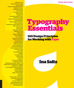
Typography Essentials Revised and Updated
100 Design Principles for Working with Type
by Ina Saltz
This title was previously available on NetGalley and is now archived.
Send NetGalley books directly to your Kindle or Kindle app
1
To read on a Kindle or Kindle app, please add kindle@netgalley.com as an approved email address to receive files in your Amazon account. Click here for step-by-step instructions.
2
Also find your Kindle email address within your Amazon account, and enter it here.
Pub Date 8 Jan 2019 | Archive Date 26 Feb 2019
Quarto Publishing Group – Rockport Publishing | Rockport Publishers
Talking about this book? Use #TypographyEssentialsRevisedAndUpdated #NetGalley. More hashtag tips!
Description
Divided into four sections—The Letter, The Word, The Paragraph, and The Page—the text is concise, compact, and easy to reference. Each of the 100 principles, which cover all practical aspects of designing with type, has an explanation and inspiring visual examples drawn from international books, magazines, posters, and more.
Typography Essentials is for designers of every medium in which type plays a major role, and is organized and designed to make the process enjoyable and entertaining, as well as instructional.
Available Editions
| EDITION | Other Format |
| ISBN | 9781631596476 |
| PRICE | US$30.00 (USD) |
Featured Reviews
Saltz's reference book on typography is filled with applicable information for both graphic designers, indie artists, and indie authors who are seeking to understand how type influences readers. They broke down typography into four distinct sections: the letter, the word, the paragraph, and the page. In each section, Saltz povides rhyme and reason as well as full color examples of each concept. This book will be a valuable resource for many.
Thank you NetGalley and Quarto Publishing for the opportunity to read an advance reader copy.
 Phillip C, Reviewer
Oftentimes, the font is seen as just the words, and not as important as what they say or the pictures that are included. However, the proper font can convey just as much, and sometimes more, meaning than pictures. In fact, choosing the font, and its characteristics is an important part of graphic design.
In Typography Essentials, Ina Saltz shares what needs to be taken into consideration font-wise in a design piece. Though the particular font chosen is a big consideration, others include the weight, style, size, and position. The reasons for each aspect is given, and examples that show different applications of the aspect are provided.
Over the years, I have spent more time on choosing fonts and matching them to the message being conveyed in my designs. Though I had already learned about many of the principles of typography, I realized that I couldn't explain several of them if I were asked why I incorporated them. Others were things that I hadn't put much thought into.
Typography Essentials is a great book to keep on hand when designing, print or screen, is part of what you do. The information it contains can help you create a design that grabs attention and communicates your intended message.
I received a complimentary copy from the publisher through NetGalley. All opinions are my own.
 Melissa C, Media/Journalist
Typography Essentials is a fantastic reference for designers and design geeks alike! This could also act as a great reference/instructional tool for someone who may not be a design professional, but wants some tips or tricks for personal projects, such as website design. Each "lesson" is easy to read and is accompanied by examples of that concept. The illustrations are truly gorgeous - bordering on typography porn, really.
Whether you're looking to hone your typography skills or just want to drool over some seriously gorgeous design, Typography Essentials is a must have!
I received this book as an ARC for my honest and unbiased review.
This book is a great textbook for designers. Not only is it a great reference book but it gave me so many ideas, I had to buy it to keep on my desk!
 Myndi B, Reviewer
Based on historical evidence (i.e. all my previous reviews), it might seem odd that I would be interested in a book about typography (or maybe you’ve read enough of my reviews to know that I’m a little weird and eclectic and my interests are relatively widespread?). The truth is, I love fonts (typeface, calligraphy, lettering, etc.) Love. Love. LOVE.
Back in my early blogging days, when there was no WordPress (yeah, that’s right, no WordPress) and Blogger was an upstart (we’re talking 2001 here people), those of us who wanted to blog had to build it ourselves. From scratch. No templates, no themes, no ready-to-go anything. And while that was a royal pain in the tuchus for those of us who had no programming experience (and a tremendous learning experience!), it also meant we had a lot of control over design. And one element I obsessed over is typeface. What font would give the right feel here? What combination of typefaces would work well together? How did it complement or highlight the rest of the theme I was trying to create? It was that early foray into blogging that led to my love of fonts, how I discovered the unlimited number of choices out there and that choosing the right typeface was as critical to the final aesthetic as color scheme and graphics. So there you go, a grossly reductive history of my love for typography. 😉
But I digress, let’s get to the book, shall we?
So. Much. Fun! Seriously. So well put together. Will you become an expert on typography reading this book? Nope. But you will walk way knowing a lot more about it than you did before, and you’ll have had the treat of seeing, in fabulous visuals, what can be accomplished with well-thought out typography choices.
By and large, my favorite element of this book is the pictures that accompanied each section. Honestly, it felt like a trip to a museum. So much creativity, so much heart and soul, so much art! In fact, it made me wonder if there were any typography museums…and guess what? There are! The closet one to me is in Massachusetts, and I can’t wait to find a time to go.
Obviously the images are not the only draw here. Each section presents a different design principle for typography, and I love that the information provided is clear and concise. It presents the principle, why it’s important, how it is best applied (and how it isn’t), and is supported by the included images. The language is accessible and terminology explained. Lovely.
What can I say? Is it a book for everyone? Perhaps not. But it’s certainly a book for me. And I imagine, if you are a creative type, it would be for you as well. Personally, I could look at the pictures all day long…
Brilliant all around!
 Joelene W, Reviewer
Typography Essentials contains a wealth of information for both beginners and experienced designers alike!
As an aspiring self-taught designer/developer/product person, I found it to be an invaluable resource. Typography is a crucial part of successful design but can be difficult to master.
Ina Saltz has done a great job of breaking it down in a practical way that is easy to understand and apply.
**Thanks to NetGalley and the publisher for the ARC! All opinions are my own.**


