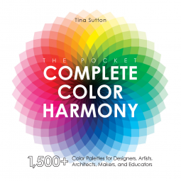
The Pocket Complete Color Harmony
1,500 Plus Color Palettes for Designers, Artists, Architects, Makers, and Educators
by Tina Sutton
This title was previously available on NetGalley and is now archived.
Send NetGalley books directly to your Kindle or Kindle app
1
To read on a Kindle or Kindle app, please add kindle@netgalley.com as an approved email address to receive files in your Amazon account. Click here for step-by-step instructions.
2
Also find your Kindle email address within your Amazon account, and enter it here.
Pub Date 13 Oct 2020 | Archive Date 3 Nov 2020
Quarto Publishing Group – Rockport Publishing | Rockport Publishers
Talking about this book? Use #ThePocketCompleteColorHarmony #NetGalley. More hashtag tips!
Description
Get an introduction to using the color wheel and discover the key aspects of color, such as warm, cool, pale, and bright. Then, delve into moods and color and see how a wide variety of palettes can come across as earthy, powerful, regal, calm, dependable, and more.
In this book you’ll discover:
- Hundreds of organized color palettes that can be used for a variety of art and design projects.
- Why certain colors attract.
- How colors evoke certain moods.
- Advice on choosing the best colors to work with.
- A CMYK process color chart and color swatches to make choosing colors and palettes easy.
With all the expert information in this convenient portable guide, you’ll feel confident in every color choice.
Available Editions
| EDITION | Other Format |
| ISBN | 9781631599200 |
| PRICE | US$15.99 (USD) |
| PAGES | 192 |
Featured Reviews
Virtual symphony of colors for anybody artistically inclined. This book explores how to use color in art and which colors work well together. I highly recommend it
 Janet P, Reviewer
i love the Color Harmony books and own several of them. This entry, in a convenient size condenses the schemes in the first two books (the basis for all the others) and presents it in a way that is really helpful.
The heart of the book are the color schemes, grouped first by mood and then by type of sceme. After noting the central color for each mood, there are 59 schemes with two or three colors, in all the color schemes. Each scheme is shown using the colors from the 100= pallette that is the basis for the work.
Each of those colors is shown first on the color wheel and then in a numbered swatch. Those numbers appear under the swatch whenever it is used. There are 8 shades for each color and the ten shades in the standard grey scale.
Using these colors is made easier by several tools in the back of the book. First there is a table listing all the colors, with small swatches and their process (CYMK) numbers. Next, the swatches are shown with the CYMK numbers next to them. On facing pages are color cards that could, i think, be cut out and used for matching.
This is a gloriously useful book for anyone, in any medium who works with color.
 Susie F, Reviewer
I was surprised at how interesting this was, there was so much I didn’t know about colour. From putting colours together to telling you the uses of certain colours, such as the colour orange which encourages oxygen intake to the brain to get your creative juices flowing. A great book to dip in and out of as well – one for the coffee table.
Thank you NetGalley for my complimentary copy in return for my honest review.
This is an excellent color reference for artists, or really anyone who just wants to know what colors look good together. The reference work also gives the reader sets of color combinations that project certain emotions and feelings. It’s an easy, ready-made guide usable by anyone and that makes it cool! The pocket size makes it an accessible and convenient way to always know what color combinations you need in a given situation. All in all, a nice work!
I love the section that presents 48 swatches of colour combinations for each of the moods or styles like powerful, rich, friendly, fresh, calm, magical and 20 others! (The combinations are categorized as complementary, primary, monochromatic, split complementary, analogous, neutral, clash or split)
As an art journaler, I am still learning how to combine harmonious colours that are beautiful expressions of emotions or styles.
Overall, a very helpful, informative and gorgeous reference book on colours.
I am looking forward to adding this book to my collection of art books!
Thank you Netgalley and the publisher for the ARC. This is my honest opinion.
Wow, I love this color harmony book! As an artist and art teacher, I have purchased and read many books on color and color theory over the years. But this one really stands out from the rest I have used before, with its gorgeous color palettes and images! I am looking forward to purchasing this pocket guide (I reviewed a digital copy) and using it while I plan and create my own artworks & in teaching.
The book breaks down the basics of color theory and color harmony in a simple, visually engaging way! The text layout and information shared complements the images used so well. It's a pleasing book to look at and learn from! In addition to including an intro to color and how to use it, you also learn about warm/cool colors and color meanings & associations. There are countless color scheme examples for any mood you want to express, and I loved looking through them all to get some fresh ideas to try. There is a process color conversion chart at the end of the book as well.
 Rosa S, Educator
Whew. That's a lot of color - and there are a lot of combinations 1500 - in this book, along with photos and examples of how to use the palettes. You'll find ideas you recognize and many you have never thought of.
Can be used as a reference manual, an inspiration, or a guide to thinking about colors and combinations in new ways. Recommended for designers, artists, and the curious.
An in depth look at color, this book is beautiful on every page. If you are a designer, artist, educator, or just someone who loves color, you will want to put this book on display. It is gorgeous and inspiring!
An interesting book in which I learnt a lot about colors!
I'm fascinated by their significance, their "stories", the way we can/should/do use them, what they do to the brain, and the reader does have information about all of this here!
I loved how it was divided, the way it explained things: I'm not an expert, and I understood everything!
It was an excellent idea to illustrate it: a book about colors without any colors inside would have been sad!
I'd really like to have it on my shelves to dive back into it when I need an information about, say, purple! So, it was a great introduction to colors, how they work (or not!) together, how we can "use" them, what they do to us!
 Agnes P, Reviewer
It's a dictionary of color, that contains minimal information on color theory, but offers a rich insight into the properties and effects of the various colors and their numerous combinations. So this is a shortcut the artist may use to achieve the desired effect. For digital artist and for printing is useful (and first time I've seen in an artbook) the Process Color Conversion Chart. Obviously the book is full of color and well presented.
The Pocket Complete Color Harmony is a color reference with over 1500 suggested palettes. This is a pocket sized abbreviated companion to The Complete Color Harmony by the same author. Released 13th Oct 2020 by Quarto on their Rockport imprint, it's 192 pages and available in compact paperback and ebook formats.
This is a very concise and accessible introduction to color theory and use. The introduction includes info about the color wheel and primary, secondary, and tertiary colors, but it provides additional information about actually choosing and *using* color (which is where most of us stumble). The author also includes info on the artistic process, and shading, tint, brightness and other technical aspects but additionally provides a multitude of palettes already made for people looking for some direct help (stitchers, painters, decorators, makers, etc).
The palettes are arranged roughly thematically: purity, richness, boldness, and many (many) more. Palettes are provided with 2-3 color swatches each, numbered by hue, tint, and shade. There's a key to the numbering and labeling of the colors at the beginning of the book along with suggestions for how to use them. I'm not 100% sure exactly how useful the system is (it's not, for example, the pantone codes) but for general use it's quick, usable, and layman accessible.
This would be a nice selection for maker's group, artist's studio, fibre-artists, guild groups, library acquisitions, and similar. Four stars. (For readers - it goes without saying that the electronic version must be accessed on a device which has a color screen).
Disclosure: I received an ARC at no cost from the author/publisher for review purposes.
I really loved this book. A lot of art books give you a primer but this takes color theory deeper. This goes over a variety of pallets as well as going into the psychology and history of the colors. The book includes gorgeous photos that help you truly see what are you are reading.
Readers who liked this book also liked:
Rev. Dr. Suzanne Nicholson
Christian, Nonfiction (Adult), Religion & Spirituality
