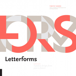
Letterforms
Typeface Design from Past to Future
by Timothy Samara
This title was previously available on NetGalley and is now archived.
Send NetGalley books directly to your Kindle or Kindle app
1
To read on a Kindle or Kindle app, please add kindle@netgalley.com as an approved email address to receive files in your Amazon account. Click here for step-by-step instructions.
2
Also find your Kindle email address within your Amazon account, and enter it here.
Pub Date 3 Jul 2018 | Archive Date 20 Aug 2018
Quarto Publishing Group – Rockport Publishing | Rockport Publishers
Talking about this book? Use #Letterforms #NetGalley. More hashtag tips!
Description
Now, in Letter Forms: The Design of Type, Past to Future he takes readers even deeper, expertly guiding them through the aesthetics as well as the technical considerations of his subject. He begins with an overview spanning the invention of movable type to today's digital typography, and ends with a showcase of contemporary fonts.
Samara's true focus in this book is conveying the essentials of type design to practitioners, and thoughtfully and thoroughly explaining and illustrating the development of form and style. He walks you through letter form anatomy, stroke formation and rhythm, tool methodologies, structure and proportion, tool methodologies, and tons more.
This all makes for one excellent, timely reference work that designers can return to in designing logos, wordmarks, signage, titling accents, and all of their graphic design work.
Marketing Plan
Position this as a thorough guide of the aesthetics and the technical considerations of type design by bestselling author and designer Timothy Samara. Provides an overview that spans from the invention of movable type to today's digital typography, and ends with a gallery of contemporary fonts.
Key Selling Points:
- Shows artists how to apply the information to their own titling, signage, website and blog designs and other purposes for work and activities.
- Will appeal to our calligraphy and lettering customers as well as design students and professionals.
- Leverage author’s Online presence for exposure, pre-orders, etc. – his website.
- Multiple outlets will be interested – Art and Design Media, Magazines, Websites
- Target Design market and Design Educators
Retail: Finished Advances
Consumer:
- Quarto Knows social media to follow and promote authors efforts
- Giveaways at art blogs and websites
- Pitch to art and design magazines and websites for review, such as Artforum, Art in America, Artvoices, InVision, Co.Design, Photoshop User, Core77, etc.
- Pitch to freelance art writers and Design Educators
- NetGalley
Available Editions
| EDITION | Other Format |
| ISBN | 9781631594731 |
| PRICE | US$30.00 (USD) |
| PAGES | 240 |
Featured Reviews
Following a detailed, yet abridged, history into the origins of today's letters, this book introduces different font faces and what their tiny details might tell us about the font, design conventions, formal construction, optics, light and shadow, and many more. There is, for example, a section on terminal shaping, how the end swirl, or not swirl, of a letter should look like and what the different forms are called.
This book is more about the aesthetics and the history and evolution of letters rather than a how-to for different fonts, or lettering.
I'd recommend this book to anyone who is interested in more than just the basics about fonts, people who might work in design or arts departments - or any other font nerd.
Letterforms is a wonderfully interesting read. Beginning with a detailed history of typography, the book goes on to look in-depth at the formation of letters and, from that, typefaces, and ends with a summation of some of the trends of the last twenty years. This is a work that will be of huge interest to graphic designers, but which will also appeal to the average layperson looking to learn more about the subject. I certainly found it fascinating, and as you would expect from a book on this subject, the pages are beautifully laid out. All in all, it is an informative and engaging read.
I should probably preface this by saying that I love typography. It’s my favorite graphic design focus, and I love reading about the history of fonts and typefaces. Naturally when I saw this book I knew there was no way I could continue without having read it, so here I am.
Letterforms is wonderfully comprehensive in the subject that it is covering. Everything from the history to how individual letters were invented, to their evolutions (accompanied by fun anecdotes), and finally even their reinventions.
That doesn’t sound like that much to squish into one book, but trust me when I say that it is. The history of type is actually quite long and sometimes overwhelming. This book gives a full and comprehensive look at it without throwing too much information at once. In short, it’s the perfect balance. Never one did I feel like I was reading a list of facts as opposed to an actual novel, and that exactly what I was hoping for.
Reading about the invention and evolution of the individual letters was fascinating. I knew the basics, but honestly I’ve never seen such an in-depth explanation like this one. I’m absolutely thrilled with it. I actually wish I had this book when I was working on my graphic design degree, but alas…
If you’re looking to learn about something new, or have already found yourself fascinated with letterforms, then this is absolutely the book for you. It’s charming and informative and very well written.
 Journey A, Reviewer
I have a subconscious fascination with typography. Fonts on buildings, menus, signs, and books to name a few intrigue me beyond comprehension, which is why I was interested in reading "Letterforms" and this book does not disappoint. It spans the history of the written word and pays respect to early font styles to show how today's fonts had the opportunity to be. As a sideline fan, I was not aware that there was such a science behind a font, and how everything little like the symmetry of a letter or the weight of a stroke plays a part in creating a readable font. It was like seeing how the sausage was made to some of the most recognizable and frequently used fonts. The book is so well-written, it could be a textbook and I enjoyed every minute of seeing the evolution of font styles.
Providing a very detailed (yet abridged) history of typography and fonts, this book introduces the aesthetics of fonts and evolution of letters to readers. Each part of the evolution and history is given a detailed explanation along with lots of pictures, making it a perfect book for reference and people who love the art of letters.
----------
Overall: 4/5
Appealing: 4/5
Cover: 5/5
Writing: 5/5
Page Design: 5/5
LETTERFORMS is an incredibly helpful reference book for anyone interested in type and graphic design. Created by Timothy Samara, a letterform world authority, this attractive book covers the topics of history, aesthetics and technique. A critically important resource for any serious artist, graphic designer and instructor. 5/5
Grateful to the Quarto Publishing Group - Rockport Publishing and NetGalley for the early copy, in exchange for my true review.
#Letterforms #NetGalley
This is a comprehensive history of Type faces. Everything you ever wanted to know or wondered about is included. Along with the wealth of information there are lots of illustrations and examples. There is a lot of information here, too much to absorb in one reading. This book is a wonderful reference that you can use again and again. It will make a wonderful gift. Enjoy
 Ricardo D, Reviewer
A valuable treasure trove for any aspiring or existing graphic designer, regardless of your current position in the field, Letterforms makes a great reference book as well as an exciting encyclopedia (of sorts). If you're a graphic designer curious for deeper knowledge about previous styles of design or how certain typography styles came into being and maintained their popularity, then make sure you grab a copy.


